Comprehensive Insurance

Driving user adoption and revenue growth

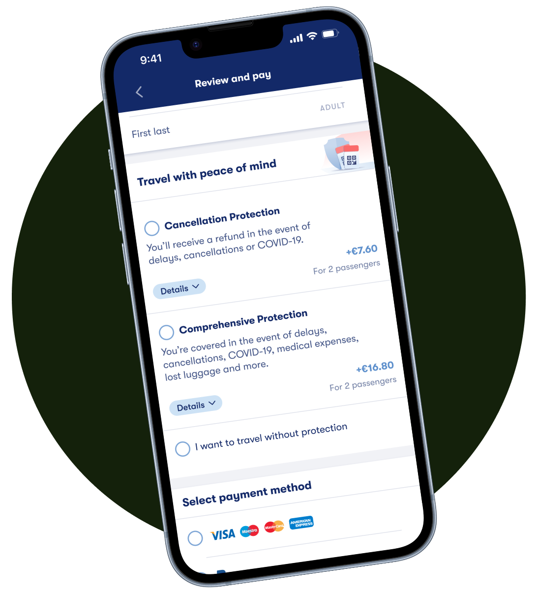
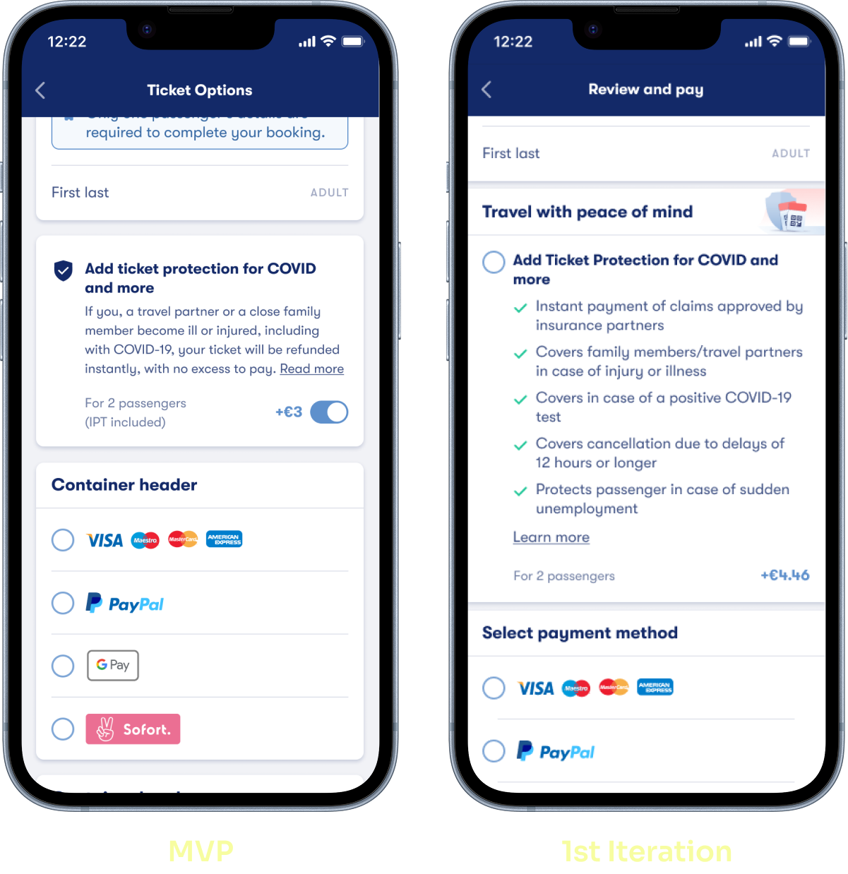
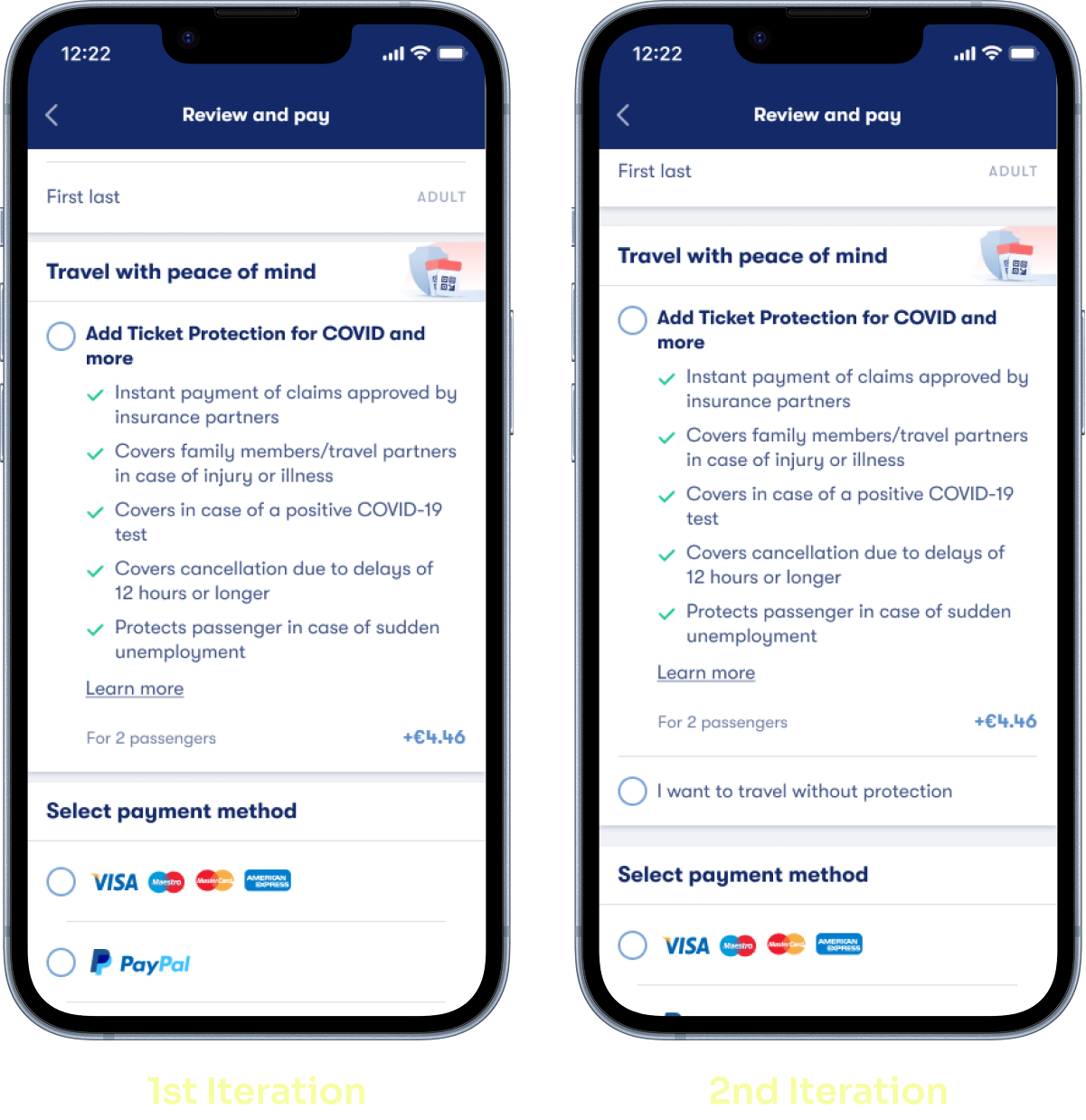
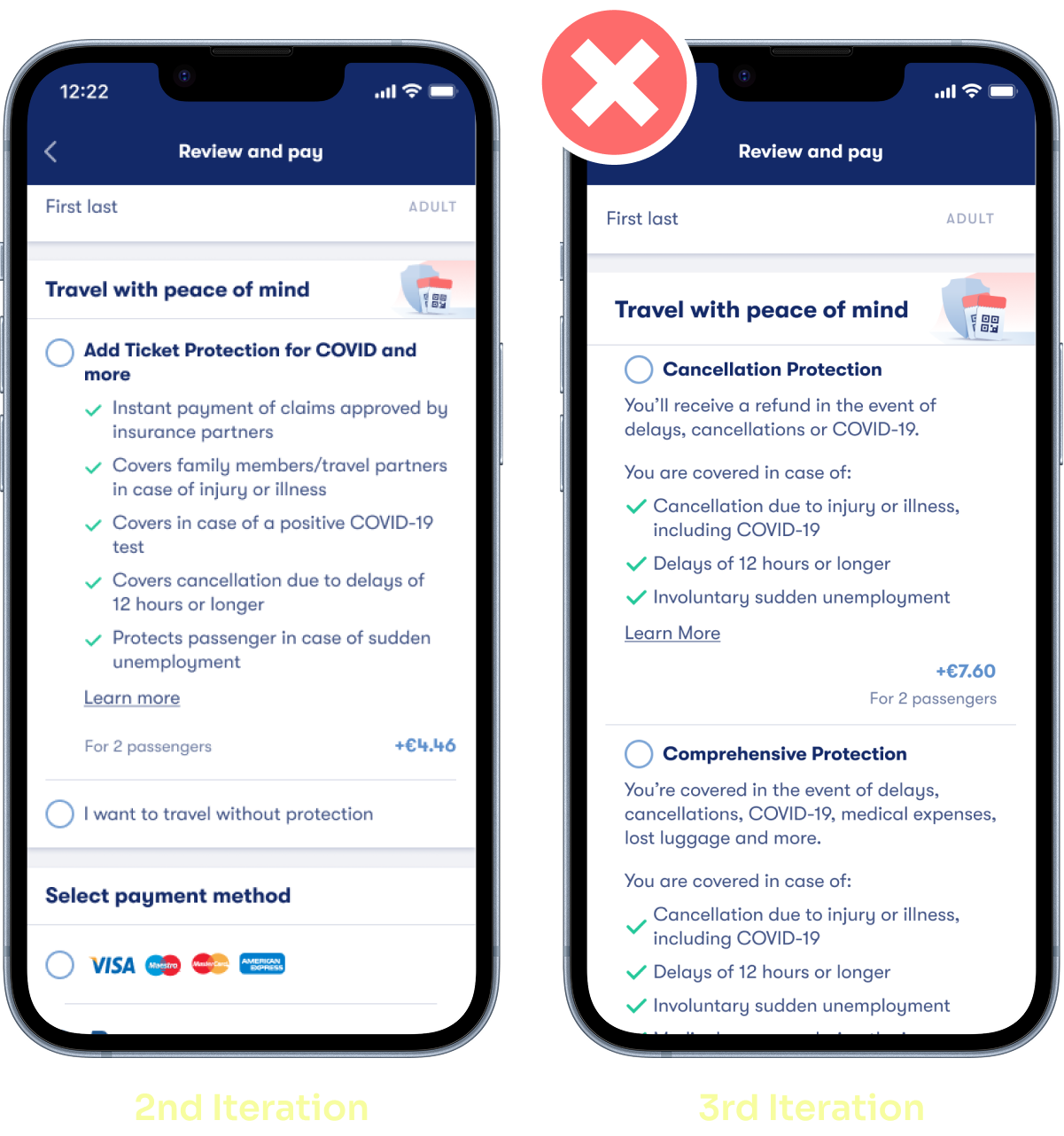
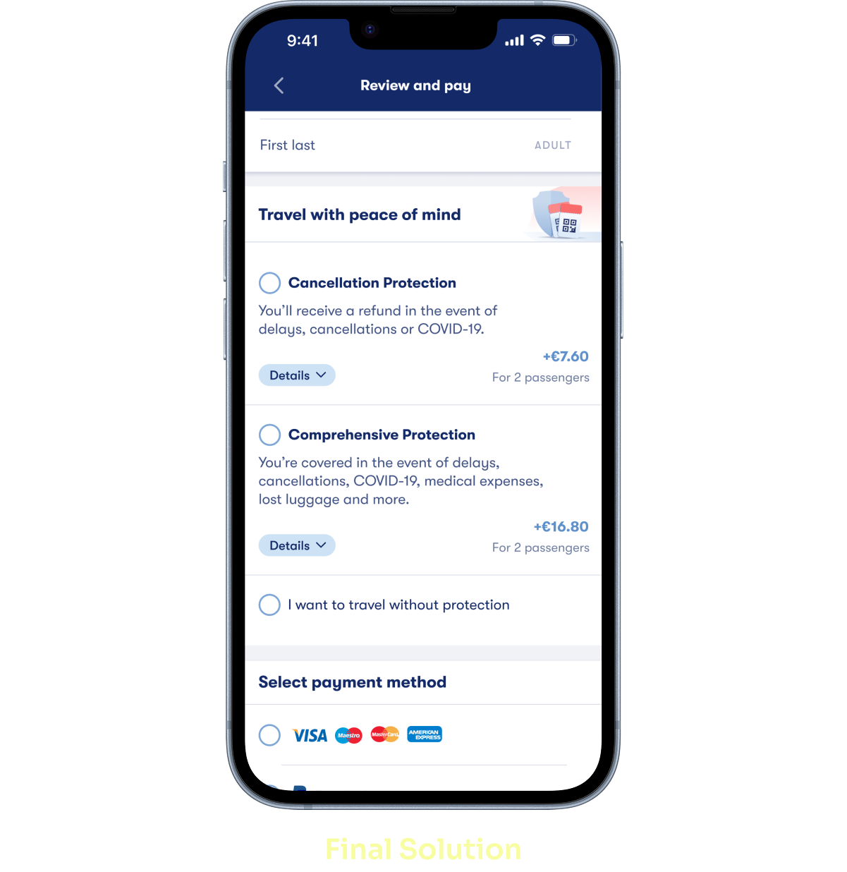
A project focused on helping travelers booking train tickets on Omio understand their protection options and confidently choose the insurance plan that fits their trip.

Role: Lead Product Designer

Team: Product Manager, Engineering Manager and me

Challenge: Users were not clearly understanding the value of insurance during their travel bookings, which resulted in low adoption and uncertain decisions.

Objective: Make the protection selection easy to understand, compare, and trust.

Impact:

Shiedl User Icon

+404k
policies sold

Save Money Euro Icon

€605k
in additional revenue

Trade Up Icon

40%
growth in adoption

Comprehensive Insurance Mockup

Project Overview

When the project began, many travelers booking train tickets on Omio were unsure about the value of adding insurance. This lack of clarity led to low adoption, with an attach rate of only 3.8% and a take rate of 0.12% . At the time, insurance coverage was also limited to just three countries.

Our goal was ambitious:
make insurance easy to understand, easy to choose, and easy to trust.

As a cross-functional team of three, we expanded coverage from 3 to 23 countries while redesigning the entire insurance selection flow. We wanted to ensure that users across different markets could easily understand their options and confidently select the protection that matched their trip.

How might we streamline the insurance selection so users can quickly discover and choose the protection that truly fits their needs?

Shield Icon

Easy to trust

Cursor Selection Icon

Easy to choose

Idea Icon

Easy to understand

Enhancing User Perception

User testing and quantitative data revealed a key problem:
Users were not clearly understanding the benefits. This made it difficult for them to feel confident choosing a plan.

Idea Icon

Insight

Nudge

Subtle hints can influence decisions

Visual cues can guide decisions without pressure. Small reinforcements help users process information faster and reduce uncertainty.

To address this, I simplified the layout, reduced cognitive load and introduced behavioral nudges. The list-view format improved readability, and positive checkmarks highlighted the most important benefits.

Impact: Attach rate increased to 4%, and the take rate increased to 0.16%.

MVP Mockup in comparison to the 1st Iteration

Encouraging Mindful Choices

Early A/B tests showed that many travelers moved through the booking flow without realizing they had skipped the insurance section. They were not rejecting the product, they simply weren’t aware of the decision.

To bring intention to the process, I introduced a clear option:
“I want to travel without protection.”

Idea Icon

Insight

Decoy Effect

A well-structured option can bring clarity without pressure.

When users are choosing between alternatives, the addition of a less attractive option (the decoy) can influence their perception of the choices.

Although the Decoy Effect is often linked to persuasion, here it was used transparently to support informed decisions. Presenting “travel without protection” as a valid option kept the experience honest, user-first and free from hidden influence.

Impact: This simple change increased attach rate by 2.5% while keeping conversion stable.

1st Iteration in comparison to 2nd Iteration

Balancing Flexibility with Clarity

When more protection options were introduced, the intention was to offer greater flexibility. However, testing revealed an unexpected pattern: instead of feeling supported, users felt overwhelmed. With too many plans on the screen, comparisons became harder and hesitation increased.

Idea Icon

Insight

Framing effect

The way information is presented affects how users make decisions

It happens when your decision is influenced more by how the information is presented (or worded) than by the information itself. It's partly due to the fact that people evaluate their losses and acquires in a asymmetric fashion.

Although this iteration decreased attach rate by 15%, it became an important learning moment. It showed that presenting more options only works when the format is simple and digestible.

Clarity, not quantity, is what helps users feel confident.

2nd iteration in comparison to 3rd Iteration Mockups

Final Solution

Based on the insights gathered, I redesigned the insurance component to:

  • Strengthen the visual hierarchy
  • Simplify content blocks
  • Highlight the benefits users care about most
  • Reduce cognitive load
  • Improve comparison between plans

The final experience allowed travelers to understand differences at a glance, making the decision-making process smoother and more intuitive.

Results

A 40% uplift in both attach and take rate, directly contributing to higher revenue and a more confident user experience.

Final Solution Mockup

Learnings and Outcomes

Looking back, this project became a clear example of how intentional, insight-driven design can create meaningful impact. Each iteration taught us something new about how travelers interpret information, make decisions under uncertainty and respond to clarity.

By combining behavioral insights with clear messaging and stronger hierarchy, the final experience became simpler, more intuitive and more effective for the users and for the business.

Results

Shiedl User Icon

+404k
policies sold

Save Money Euro Icon

€605k
in additional revenue

Trade Up Icon

40%
growth in adoption

More than just numbers, these results show how clarity drives confidence, and confidence drives conversion. When we empower users to understand their choices, the business grows naturally, and the experience becomes one they can trust.

"Keep in mind that MVP gets you to the basecamp of the opportunity mountain."
— Annina Koskinen - Spotify

Iteration is what turns good ideas into real outcomes. Each version of this product revealed new insights that guided the next step. Through feedback, data, and continuous refinement, we transformed a challenging experience into a seamless and effective one.